Welcome to the Y.our E.nvironment O.f the W.eek!
We’re sharing inspiring and influential project solutions to increase the presence of design in our practice as we have the responsibility of shaping environments in the world for ourselves and the future.
Scott and Julie Brusaw are ready to show the world that we could build solar-collecting, energy-producing, safe and smart roadways.
And by ready, they mean everything is in place. The Sagle, the Idaho couple’ s Solar Roadways enterprise, received a $750,000 Small Business Innovation Research grant from the federal highway administration last week to fund an ambitious second phase of their project that will result in a complete and functioning solar parking lot outside of Brusaw’s lab.
Solar Roadways had already made inroads with the highway administration when the concept gained serious traction at the GE ecomagination competition last year.
Now Solar Roadways is getting some attention, and it’s becoming easier to find needed resources, Scott Brusaw said.
The greatest roadblock to seeing the idea through to the end has been finding the right glass to cover roadway solar panels, Brusaw said. The glass has to be clear in order for the panels to work, but textured enough to give drivers traction.
“We found a glass sidewalk panel in New York City,” Brusaw said. “It’s perfect.”
He said the panel manufacturers know what they’re doing and have created a glass panel designed to keep pedestrians safe in all weather conditions that’s still perfectly clear.
The strong, textured glass completes Brusaw’s vision, and he now has everything he needs to build a solar parking lot.
But having the glass nearly in his hands has led him to another idea, a way to make the solar roadway concept even more amazing and useful.
“We’re going to work together on forming prisms in the glass,” Brusaw said. “We think we can concentrate the sun onto the solar panels and get greater efficiencies.”
Brusaw said he thinks the money from the grant should be enough to finish a prototype parking lot—just exactly enough with no room for errors or experimentation, he said.
For that reason he’s still fundraising to try to supplement the grant money and allow a little wiggle room in the prototype development.
“If everything were to go perfectly, we could be finished in two years,” Brusaw said of the prototype parking lot. “But that’s if everything were to go perfectly. I expect to run into a few problems.”
Years ago, when the phrase "Global Warming" began gaining popularity, we started batting around the idea of replacing asphalt and concrete surfaces with solar panels that could be driven upon. We thought of the "black box" on airplanes: We didn't know what material that black box was made of, but it seemed to be able to protect sensitive electronics from the worst of airline crashes.
Suppose we made a section of road out of this material and housed solar cells to collect energy, which could pay for the cost of the panel, thereby creating a road that would pay for itself over time. What if we added LEDs to "paint" the road lines from beneath, lighting up the road for safer night time driving? What if we added a heating element in the surface (like the defrosting wire in the rear window of our cars) to prevent snow/ice accumulation in northern climates? The ideas and possibilities just continued to roll in and the Solar Roadway project was born.
Our latest video - by Michele Ohayon
In 2009, we received a contract from the Federal Highway Administration to build the first ever Solar Road Panel prototype. During the course of its construction, we learned many lessons and discovered new and better ways to approach this project. These methods and discoveries are discussed throughout this website. http://solarroadways.com/intro.shtml Please enjoy and send us any questions that you may have. This YERT video is featured in their full-length documentary, now being screened across the U.S. For a screening or presentation near you, click on the following "YERT plate":
After successful completion of the Phase I SBIR contract, we were awarded a follow-up 2-year Phase II $750,000 SBIR contract by the Federal Highway Administration beginning in 2011. With this award, a prototype parking lot will be built and then tested under all weather and sunlight conditions.
The heart of the Solar Roadway™ is the
Solar Road Panel™
The Solar Roadway is a series of structurally-engineered solar panels that are driven upon. The idea is to replace all current petroleum-based asphalt roads, parking lots, and driveways with Solar Road Panels that collect energy to be used by our homes and businesses. Our ultimate goal is to be able to store excess energy in or alongside the Solar Roadways. This renewable energy replaces the need for the current fossil fuels used for the generation of electricity. This, in turn, cuts greenhouse gases literally in half.
Each individual panel consists of three basic layers:
Road Surface Layer - translucent and high-strength, it is rough enough to provide great traction, yet still passes sunlight through to the solar collector cells embedded within, along with LEDs and a heating element. It is capable of handling today's heaviest loads under the worst of conditions. Weatherproof, it protects the electronics layer beneath it. Electronics Layer Contains a microprocessor board with support circuitry for sensing loads on the surface and controlling a heating element. No more snow/ice removal and no more school/business closings due to inclement weather. The on-board microprocessor controls lighting, communications, monitoring, etc. With a communications device every 12 feet, the Solar Roadway is an intelligent highway system. Base Plate LayerLayer - While the electronics layer collects energy from the sun, it is the base plate layer that distributes power (collected from the electronics layer) and data signals (phone, TV, internet, etc.) "downline" to all homes and businesses connected to the Solar Roadway. Weatherproof, it protects the electronics layer above it.
Dutch studio MVRDV has given the new Oslo headquarters for Norwegian bank DNB a pixellated appearance by building a stack of brick and glass cubes. The irregular arrangement of the six-meter wide cubes creates recessed openings across the facade, which MVRDV has used to add sheltered terraces to each floor and a new route from the waterfront towards the nearby railway station.
MVRDV completes DNB Bank Headquarters main building in Oslo The central building of DNB’s new bank headquarter cluster developed by Oslo S Utvikling (OSU) is completed. The MVRDV designed main building has 17 unique floors and a surface of 36,500m2. The pixelated volume based on small-scale working units adapts to the various influences of the urban context, combining an efficient and flexible internal organisation with a variety of specific communal spaces such as the main entrance lobby, a transparent trading floor, a sheltered public passage, respect for urban view lines and collective terraces overlooking the fjord to the south. The glass and brick exterior expresses both the transparency and stability of DNB as a modern financial institution.
Above: photograph is by Jeroen Musch The development of the new headquarter cluster is a strategic operation concentrating the DNB offices formerly spread out over Oslo at one location, aiming for synergy and a clear identity. The objective was to translate the social and democratic character of the organisation into a building with excellent working conditions and spatial qualities that would stimulate efficiency, identity and collaboration. The design is based on an ideal work group of the bank, a pixel of 6×6 metres, whose versatility permits adaptation to the flexible nature of the organisation. Besides more than 2,000 flexible work spaces the building contains a panoramic 140 seat canteen on the top level, the executive lounge with a view over the fjord, the board room, in the heart of the volume DNB’s trading room with 250 work stations, and the main entrance with the reception and access to the concourse that connects to the two neighbouring volumes. The collective spaces are connected by a staggered continuous internal route of collective terraces, all being executed as glass pixels, encouraging informal meetings and communication between employees.
Above: photograph is by Jeroen Musch This route meanders from the reception upwards through the building, connecting all 17 levels office levels with the communal areas. A series of wooden stairs and bridges allow employees to switch levels or even to walk up to the canteen on one side of the building and down on the other side. The route accommodates communal areas to the office floors and is made homely with a series of pantries, informal meeting areas, reading-rooms, lounges and fire places. It gives access to the various outdoor terraces and roof gardens. All these collective spaces offer views to the surroundings and transparency from out side. The route is naturally ventilated and has a high performance glass fit for the cold Norwegian winter. The generic office floors recline and are recessed in various places to answer to the urban context creating communal indoor and outdoor areas and outstanding daylight conditions. At street level the building volume is opened to give space to sheltered entrance zones, and intersected by a public passage creating a public route between Oslo Central Station and the fjord. The pixelated design allows this specific response whilst being highly efficient and flexible. As a result, every floor of the building is both unique and generic: the pixelated volume makes the generic specific.
Above: photograph is by Jeroen Musch The structure is conceived as a steel rack wrapped in a brick skin, covering all exterior terraces, walls and ceilings with bricks, which adopts Norwegian environmental standards and gives a human scale to the building. It appears as a rock, a strong shape within the boundaries of the Barcode. The international Norwegian financial institution DNB decided to concentrate their twenty office locations currently dispersed over the city in the Bjørvika Barcode, an urban plan by MVRDV / DARK / a-lab next to Oslo Central Station. In 2007, the masterplan team was commissioned by developer OSU to design the urban concept for DNB’s headquarter complex. A new cluster of three volumes (80.000m2) and a common basement with a 3,000m2 underground concourse, which interlinks the three buildings of the bank, was developed. MVRDV was commissioned as architect for the central main building and co-responsible for the urban concept and concourse.
Above: photograph is by Jeroen Musch MVRDV has collaborated with Norwegian co-architect DARK Arkitekter AS and various Norwegian engineering firms. Project management is executed by Norwegian firm Vedal Project AS. The second building of the DNB cluster is designed by A-lab and the third building by Dark Arkitekter, within the overall Bjørvika Barcode masterplan. The cluster will be officially opened May 14th 2013. DNB is the largest financial services group in Norway. The Group consists of brands such as DNB, Vital, Nordlandsbanken, Cresco, Postbanken, DnB NORD and Carlson. In 2003, MVRDV, together with Norwegian firms Dark and a-lab, won the competition for the Bjørvika waterfront development with the design of the Bjørvika Barcode; a dense, open and differentiated urban master plan along Nyland Allé, that is developed and realised by OSU in phases. DNB Life Insurance (DNB Scandinavian Property Fund) bought the 3 buildings last year for 4,8 billion Norwegian krone.
Museum Plaza rethinks conventional attitudes towards property development. It begins with a vision to construct a contemporary art institute and concludes with a business pro forma that supports this commitment. Culture is placed physically and spiritually at the project’s center.
To support the capital and operational costs of a 3,700 m² (40,000 sf) art institute, a development of over 141,800 m² (1,530,000 sf) is needed. To avoid over-saturating Louisville’s market with any single commercial program, its uses are necessarily mixed, including luxury condominiums, hotel, offices, loft apartments, and retail.
The economic and dimensional imperatives of the project are resisted by the physical constraints of Museum Plaza’s site. Located within the Ohio River’s 100-year flood plain, between a levee wall and an interstate highway, the site is a disparate set of parcels with no immediate relationship to Louisville’s Central Business District. The site is further complicated by a subterranean electrical utility right-of-way and several arterial streets.
Convention would typically position the public program-both cultural and commercial-at street level and the profit-making towers above. This strategy is not possible at Museum Plaza, as the site would cut off any ground-level public program and position the towers implausibly close to each other.
To liberate these conditions, the plinth of public program (the “Island”) is elevated 24 stories aloft and the towers evenly distributed above and below.
The luxury condos and offices above and the hotel and loft apartments below are profit machines: their areas, plans, and views are dictated by the market, optimizing financing and maximizing rents and sale prices. The towers’ independence allows each to be designed and financed on its own terms, and renders the unusualness of the overall massing less consequential.
By keeping the towers discrete, their dimensions and the resulting pro forma remain adjustable-like a stereo equalizer-during the project’s design. Market exposure is thereby reduced to only three months-the time between submitting the exterior envelope for wind tunnel analysis and starting construction on the foundations based on the analysis’ results.
In contrast to the towers, the Island houses all the unique and public elements of the development, both cultural and commercial. By isolating the project’s uniqueness within the Island, difficulties such as exiting, circulation, and security are also contained. Creation of construction documents for the rest of the building is thereby accelerated, and construction started over a year before the Island’s design is complete.
The collision of cultural and commercial uses within the Island (galleries, pool, auditorium, bar, education spaces, gym, restaurant, hot shop, ballroom…) provides fruitful opportunity to question the typology of a contemporary art institute. Museum Plaza advances several issues facing art institutions, including gallery flexibility, synergy between culture and commerce, and procession.
The two normative gallery typologies-the white box and (since Bilbao) the articulated box-challenge their institutions’ operational budgets. With the white box, institutions must spend copious funds to invent unique environments for each new show. With the articulated box, institutions must spend copious funds to quiet the architecture’s voice for each new show. Museum Plaza’s galleries combine the white box’s flexibility with the uniqueness of the articulated box. Two large, easily repartitioned galleries are stacked in the middle of the Island.
Seemingly banal, the galleries are rendered unique by several remarkable views-one up between the towers, one down 24 floors to the park beneath-and a revolutionary design for the galleries’ perimeter walls.
Many living artists do not want to operate within institutional walls. Preferring to operate on real life, on real community, on real activity, artists increasingly shun the very institutions that are trying to house them. Museum Plaza overcomes this conundrum by bleeding culture and commerce together without compromising the galleries’ performance. A simple dot matrix, when rendered in color (including white), is perceived by the brain as opaque; when rendered in black, the brain perceives the matrix as transparent. By applying this basic optical effect to the galleries’ perimeter walls, art permeates into the everyday activities of the restaurant, cocktail bar, spa, gym, and swimming pool. Yet, the galleries maintain the pristine quality of a white box for the art patron. The galleries’ translucency allows art to perform in a whole new way-to both “see” and be seen-generating a new kind of energy and interaction between the art and the viewer.
By applying this basic optical effect to the galleries’ perimeter walls, art permeates into the everyday activities of the restaurant, cocktail bar, spa, gym, and swimming pool. Yet, the galleries maintain the pristine quality of a white box for the art patron. The galleries’ translucency allows art to perform in a whole new way-to both “see” and be seen-generating a new kind of energy and interaction between the art and the viewer.And the non-ticketed spaces, including shop, education, auditorium, and event space, serve as the main circulation for the entire Island, reinforcing the mix between culture and commerce.
The Loop’s ultimate architectural manifestation is a plate, bent to tie the cores together and to reach the cardinal points of the galleries and commercial areas.
The central galleries and their glass walls create a space for art that is not an enclosed temple, separate from life and commerce, but one which allows a range of interactions with art, from the peripheral to the engaged.
In most large developments, culture is an afterthought, a bone thrown to mollify a municipality. Museum Plaza invents the program for, and then realizes, a vehicle that literally and metaphorically places art at its center, challenging the art institute’s typology in the process.
The U.S. Department of Housing and Urban Development could approve a $100 million loan for the stalled, 62-story Museum Plaza skyscraper in downtown Louisville if developers secure a commitment for construction financing.
If HUD approves the loan, it would be a big step toward getting the $465 million mixed-use project off the ground and creating thousands of jobs in the community.
Loan expected to help developers with financing
The state of Kentucky in July applied for the HUD loan on behalf of the Museum Plaza partners as a way to help fund construction of the project, planned for Seventh and Main streets.
Specifically, the Kentucky Department for Local Government applied for the HUD Section 108 Loan, which would be granted based on plans for creating permanent and temporary jobs for as many as 7,000 people in Jefferson and surrounding counties.
The HUD response is “a very positive step forward” and should help the developers as they seek additional financing, Greenberg said. “Work remains to done before we can get the financing. We’re confident we will get it completed.”
Partners have invested $50 million
The Museum Plaza project, announced more than five years ago, is being developed by husband and wife art collectors Steve Wilson and Laura Lee Brown, developer Steve Poe and Greenberg.
Brown’s family founded Brown-Forman Corp.(NYSE: BFB), and she and Wilson are partners in 21c Museum Hotels and Kentucky Bison Co.
Greenberg, a lawyer with Frost Brown Todd LLC, said that the partners already have invested $50 million of their own money in the development of Museum Plaza.
He added that they’ve made “tremendous progress” moving the project forward during “extremely challenging times.”
The proposal for Museum Plaza, which is planned for a site roughly bounded by West Main, Sixth, Seventh streets and River Road, calls for a contemporary art museum, a Westin and a limited-service hotel, 300,000 square feet of Class A office space, shops and condominiums.
Plans also call for a public park and an 850-space parking garage.
Construction work stopped in 2008
Ground was broken on the project more than three years ago, but site work was halted in 2008 because of delays in securing permanent financing for the project. It originally was slated to be completed in late 2010. According to previous Business First reports, other funding for the project is to include:
• $90 million covered by bonds repaid through Tax Increment Financing district proceeds;
• $45 million from Louisville-Jefferson County Metro Government;
• $26.5 million from the University of Louisville, which has discussed locating its fine arts and possibly its graduate business school programs in the Museum Plaza complex;
• $15 million from bonds supported by philanthropic contributions from arts patrons.
The project is expected to create 4,500 construction jobs and 2,300 “permanent” jobs for workers in the building after it’s completed.
Live Between, a concept design by HKS Architects, is a newly launched hotel experience for guests who enjoy the extreme. Their design seeks out urban cities to set up short-term residency between existing buildings. As it moves from city to city, it is designed and installed specific to its temporary inhabitance. Taking on various forms from a spider’s web to a constellation, the hotel formation is ever changing and always evolving. More images and architects’ description after the break. Courtesy of HKS ArchitectsImagine a hotel that brings the destination to you. Imagine an experience so hard to explain, you can only see it to believe it. Imagine sleeping hundreds of feet above the ground, between buildings people work and live in. Imagine making your reservation, today. Hotel destinations are targeted towards urban cities of unique character. From Tokyo to New York, Dubai to London, the versatile hotel seeks to bring an additional economic bonus to cities known for hospitality and grandeur. This chameleon adaptability allows this design to move and expand as quickly as human life itself. Courtesy of HKS ArchitectsAs the first mobile hotel brand with a mission of revitalization, {LB} also focuses on erecting between buildings or in cities stricken with hardship. Under utilized, unoccupied and abandoned buildings set the stage for a monumental design opportunity. While the Live Between hotel is installed between these buildings, hotel amenities and services are temporarily installed in the floor plates of these environments to accommodate guest needs. {LB} takes negative, depleted space and breathes life into it, renewing interest in an area forgotten. Courtesy of HKS ArchitectsDeconstructed pods on semi-trucks ceremonially move into town, generating a buzz within each city just as the freight cars of the circus once did. A sense of energy and anticipation slowly infiltrates each city, and people begin to flock to see the procession. Although nobody ever knows if or when it is coming, the buzz is always brewing. Courtesy of HKS ArchitectsFor those hotel guests who cannot imagine jumping out of a plane or bungee jumping off a bridge, Live Between guests can rest assured their safety is secure. Designed in collaboration by architects, engineers, aerospace technicians and the multidisciplinary elite, the hotel is designed with a high strength cabling and tension pulley system. Each pod is a self-contained guestroom, with power, efficiencies and plumbing contained within the lower portion of the orb. As the exterior transparency reveals itself from solid to clear, from web-like to reflective, each aspect of the pod’s exterior is intricately designed to maximize the guest experience. Radical design, extreme imagination, superior engineering, and cutting edge technology combine to beat the unbeaten path, paving the way for the first ever urban hotel temporarily erected between existing buildings.
Azerbaijan Cultural Center in Baku by Zaha Hadid Architects Zaha Hadid’s signature sexy curves are on full display in the Heydar Aliyev Cultural Center, a fluid form constructed of glass-reinforced concrete that emerges from the folds of the landscape’s natural topography. This major new venue will play a pivotal role in the redevelopment of the Azerbaijani capital, housing a conference hall with three auditoriums, a library, and a national museum.
London Bridge Tower by Renzo Piano Building Workshop Of all the buildings added to the London skyline in the run-up to the Olympics, the most imposing is unquestionably Renzo Piano’s London Bridge Tower, located on the south bank of the Thames, next to the bustling London Bridge transportation hub. At 72 stories and 1,016 feet high, it dwarfs the mostly low buildings around it and will be the tallest building in the European Union. Nicknamed the Shard, because of its façade of tapering glass panels, the tower will contain offices, apartments, a hotel and spa, restaurants, shops, and, at its pointed top, a 15-story public viewing gallery.
Can you imagine living in this kind of house? Me? I don't know...maybe not.
It would be interesting to look around though. What do you think?
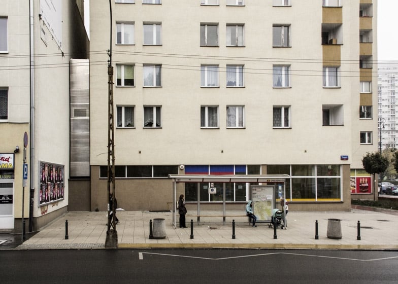
Polish architect Jakub Szczesny claims to have built the world’s narrowest house, just 122 centimetres across at its widest point. The Keret House is squeezed into a crevice between two buildings in the centre of Warsaw and will provide a temporary home for travelling writers.
“It started with the space,” Szczesny told Dezeen, after explaining how he came across the site when walking home one day. “I started to think who could live there. It had to be a person that would like to be a hermit, someone who would like to spend time alone doing something, but doing what?” Szczesny, who is one of the co-founders of arts group Centrala, approached Israeli writer Etgar Keret to get involved in the project and the pair started developing a triangular house with just enough space for a single inhabitant to live and work. “It requires a sense of humour, as you cannot stay long in a place like this,” joked Szczesny. The body of the house is raised up on stilts and a staircase leads inside from underneath. At its narrowest point the house is no more than 72 centimetres wide. “Everything was custom and everything needed to be pushed,” said Szczesny, explaining how they managed to fit in all the necessary furnishings. The house will remain in place for at least two years, but could end up staying for good. “It has already become a Warsaw icon and is already on the tourist map,” said the architect.
The narrowest Keret House with the broadest horizons Keret House is the installation art in the form of an insert in between two existing buildings. The project was launched on Saturday 20th of October in Warsaw. It is led by the Israeli writer Etgar Keret. Keret House is fully functional space in which one can live as well as create. It is located between buildings at Chlodna 22 Street and Zelazna 74 Street. “We deeply believe it will become a symbol of modern Warsaw ingrained in its complicated history. The House attracts attention of media from entire world. He hope it will show the most fascinating side of Warsaw”, say Sarmen Beglarian and Sylwia Szymaniak form Polish Modern Art Foundation, the curators of the project. The House is located on the plot measuring 92 centimeters in its narrowest point and 152 centimeters in its widest point. “That is why at first it seems that the construction of living space within such premise is impossible. Keret House is to contradict that false image, simultaneously broadening the concept of impossible architecture”, says the architect Jakub Szczesny. The house itself is 72 centimeters in the narrowest and 122 centimeters in the widest point. In the fracture of history The house is located between two buildings from two historical epochs. “The first is a brick building on Zelazna Street – a fragment of the pre-world war II city, almost no longer existing. The second – a cooperative concrete apartment building, an element of an “imposed structure”, which was aimed at negating the previous city landscape. Their adjacency is coincidental – like many architectural structures in Warsaw. Keret House is a perfect example of the so-called “non-matching” in the city’s urban fabric. Another reason is the city’s war history – where the house is located, two ghettos – the large ghetto and the small ghetto met. Only a few steps from the house, a bridge connecting the two closed spaces, stood”, explains Jakub Szczesny. Project’s founder/concept designer: Jakub Szczesny Art curators: Sarmen Beglarian, Sylwia Szymaniak Executive producer: Joanna Trytek – Black Salt Production Organiser: Polish Modern Art Foundation Co-financing: the Capital City of Warsaw Partner: National Centre for Culture Sponsor: LHI General conctractor: AWBUD Partners: GIRA, Kingspan, Decoroom, Volunta Parket, Milantex, Polish Institute in Tel Aviv, White & Case, Kostrzewa PR, Chylinski Family, Jewish Community in Warsaw, Chlodna Comedy Club, PMG Partners, Biuro Wystaw.
My goal is the active skin, whose base element (Solar module) is a flexible material in the process conceptual architectural design and construction.
Convert solar array to a material with which to compose and build architecture.
Overall, from photovoltaic laminated glass, I have developed a number of details and construction systems, such as Ventilated Façade, Curtain Wall and Monolayer Structures
that host the facilities inherent in any PV system and the different architectures that build proposals, with particular interest in the design, effective input method of this technology in the urban scene.
I try to convey the idea that the generation of clean energy can be part of the beauty of its major consumer, THE CITY.
Specifically in the photovoltaic industry, until now largely developed by engineers must entry into the industry figure of the architect to develop their integration into the urban scene.
For more information on The complete project please see links below:
New York's Grand Central Terminal, as it currently stands today, was built between 1903 and 1913. But it is the third Grand Central. Two earlier buildings — one called Grand Central Depot, and the other known as Grand Central Station (which remains the colloquial name for the Terminal) — existed on pretty much the exact same spot. But neither lasted nearly as long. The Depot opened in 1871, and was drastically reconstructed in 1899. The new building, the Station, only stood for three years before it began to come down in sections, eventually replaced by the current building.
That's a lot of structural shuffling, and at the Anthropology in Practice blog, Krystal D'Costa explains some of the history behind it. Turns out, the rapid reconfiguration of Grand Central had a lot to do with crowd control — figuring out how to use architecture to make the unruly masses a little more ruly. One early account that D'Costa quotes describes regular mad scrambles to board the train — intimidating altercations that could leave less-aggressive passengers stranded on the platform as their train left them behind.
The problem it seemed was that the interior of the depot did nothing to manage the Crowd—which could resume the same patterns of movement as they did on the street—and believe me, it was just as unruly out there. In the depot, where passengers were confronted with the unbridled power of locomotives, it was necessary to impose some sort of structure to the meeting: the Crowd had to be domesticated.
... A deadly collision in 1902 preceded public demand for an even safer, more accessible terminal. Warren and Wetmore won the bid for reconstruction, and the plan they produced included galleries, which added yet another transition area but, more importantly, rendered the Crowd into a spectacle. This design, which is the one visitors experience today, preserves the Crowd in a central area, providing raised balconies from which there are plenty of opportunities to people-watch. Being placed on display is not lost on the subconscious of the Crowd: what appears to be hustle and bustle are manifestations of many synchronizations happening at once. So what appears to be chaos to the casual observer is actually a play directed by design that makes the Crowd a key feature of the space even as it is minimized by the architectural elements that Grand Central Terminal is known for: the grand ceiling, the large windows, and the deep main concourse. These items add perspective to the Crowd and diminish its psychological power as an uncontrollable mass.
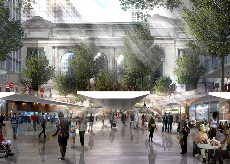
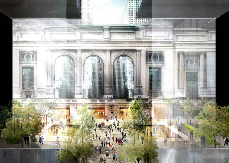
News: architecture firm Foster + Partners has unveiled proposals to increase the capacity of New York’s Grand Central Terminal by widening approach routes and pedestrianising streets (+ slideshow).
The architects were one of three teams invited by the Municipal Art Society of New York to re-think the public spaces in and around the 100-year-old station, which was designed to serve around 75,000 passengers a day but often sees as many as a million passing through.
Foster + Partners’ proposals include the pedestrianisation of Vanderbilt Avenue to the west of the station, creating a public square at the entrance to the new East Side Access lines, surrounded by trees, cafes and public art.
The plans also include wider pavements and trees on the southern approach from 42nd Street and along Lexington Avenue to the east, while larger underground spaces would lead into the terminal from Park Avenue to the north.
Inside the station, wider concourses would help to ease congestion for travellers on the 4, 5, 6 and 7 metro lines.
“The quality of a city’s public realm reflects the level of civic pride and has a direct impact on the quality of everyday life,” said Norman Foster. “With the advent of the Long Island Rail Road East Side Access, along with the plan to re-zone the district, there has never been a better opportunity to tackle the issues of public access and mobility around one of the greatest rail terminals in the world.”
Foster + Partners presented their proposals yesterday at the third annual MAS Summit for New York City, alongside American firms SOM and WXY Architecture.
In the last year the firm has also won a competition to design a high-speed rail station for Spain and presented proposals for an airport and transport hub on the estuary outside London. See more stories about Foster + Partners »
Here’s some more information from Foster + Partners:
Foster + Partners re-imagines Grand Central Terminal for 2013 Centenary
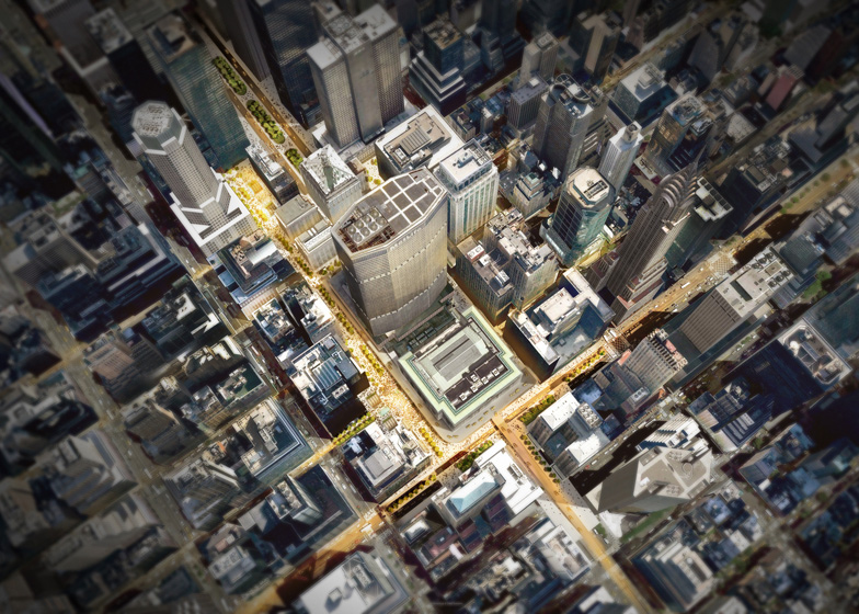
Norman Foster presented proposals for a masterplan to bring clarity back to Grand Central Terminal at The Municipal Art Society of New York’s annual Summit in New York last night. Masterplan – click above for larger image
Grand Central Terminal is one of New York’s greatest landmarks and contains perhaps the city’s finest civic space. However, over time it has become a victim of its own success. A building designed to be used by 75,000 people per day now routinely handles ten times that number with up to a million on peak days.
The result is acute overcrowding; connections to the rail and subway lines beneath the concourse are inadequate; and the arrival and departure experience is poor. Added to that, the surrounding streets are choked with traffic and pedestrians are marginalised. The rapid growth of tall buildings in the vicinity has all but consumed the Terminal.
Within the station, the proposal creates wider concourses, with new and improved entrances. Externally, streets will be reconfigured as shared vehicle/pedestrian routes, and Vanderbilt Avenue fully pedestrianised. The proposal also creates new civic spaces that will provide Grand Central with an appropriate urban setting for the next 100 years. Wider masterplan
The 42nd street entrance to the south, where access is severely constrained, will be widened to fill the entire elevation by using existing openings, thus greatly easing accessibility. The access via tunnels on the northern approach from Park Avenue will be rebalanced in favour of pedestrians by creating grander, enlarged underground spaces through the Helmsley building. Lexington Avenue to the east will be tree-lined with wider sidewalks and will benefit from more prominent and enhanced tunnel access to Grand Central Terminal. The idea already mooted to pedestrianise Vanderbilt Avenue to the west would be extended. The street would be anchored to the south by a major new enlarged civic space between 43rd Street and the west entrance to the Terminal and to the north by a plaza accommodating new entrances to the East Side Access lines. Trees, sculpture and street cafes will bring life and new breathing space to Grand Central Terminal.
At platform and concourse levels where congestion is particularly acute for travellers on the 4, 5, 6 and 7 lines, we will radically enlarge the connecting public areas, to address the huge increase in passenger traffic in the last 100 years. This will transform the experience for arriving and departing commuters and passengers. A generous new concourse will be created beneath the west entrance plaza on Vanderbilt Avenue connecting directly into the main station concourse.
This visionary masterplan with its focus on pedestrians and travellers will allow Grand Central Terminal to regain the civic stature that it deserves as a major New York landmark and an appropriate twenty-first century transport hub.
 Scott and Julie Brusaw are ready to show the world that we could build solar-collecting, energy-producing, safe and smart roadways.


")
")
")
")