Friday, July 27, 2012

Millau Viaduct, France: the Tallest Bridge in the World

from:
http://www.amusingplanet.com/2012/03/millau-viaduct-france-tallest-bridge-in.html

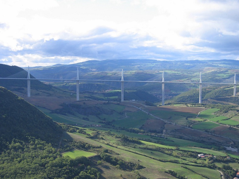
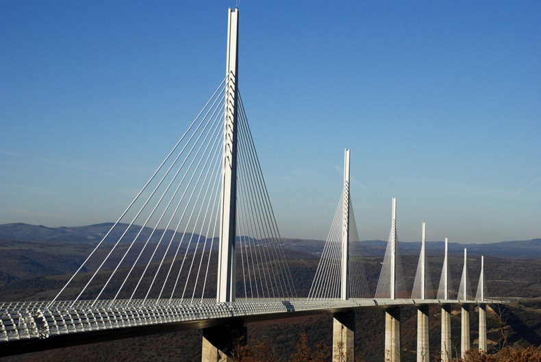
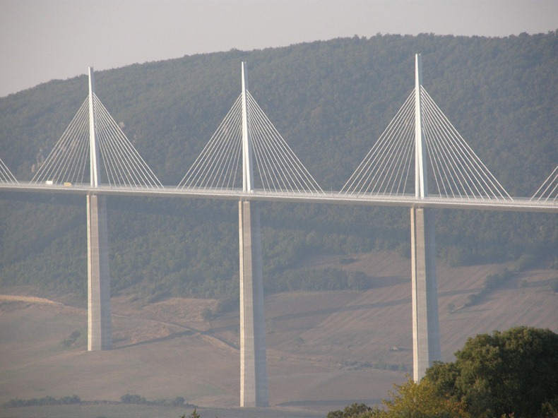
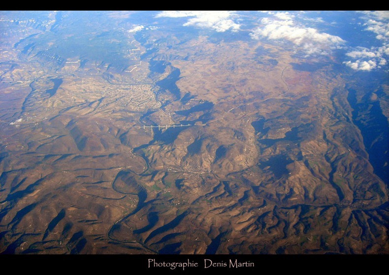
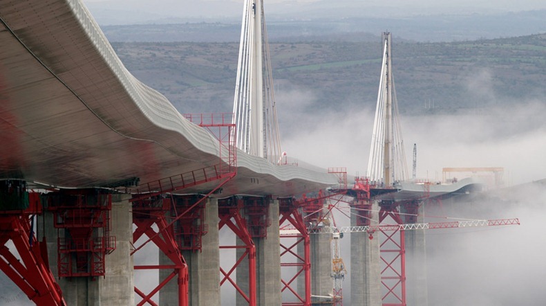
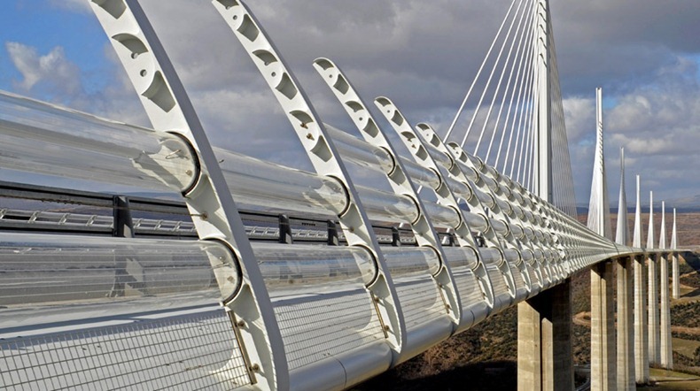
The Millau Viaduct is a cable-stayed road-bridge that spans the valley of the river Tarn near Millau in southern France. Designed by the French structural engineer Michel Virlogeux and British architect Norman Foster, it is the tallest bridge in the world with one mast's summit at 343.0 meters above the base of the structure. It is also the 12th highest bridge in the world, with a 270 meters drop from the bridge road to the valley below. The 2460 meters long bridge is a stunning architectural and design feat. And it is beautiful to look at as well.
The bridge was opened in 2004 to close the "missing link" on the A75 autoroute that connects Paris in the north to Perpignan in the south; the Millau Viaduct was the result of 17 years of ideas, proposals, and design that resulted in shaving 37 miles off the former route through the region. But rather than choose a mundane design that simply did the job, the French went big.
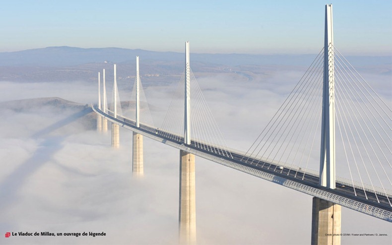
millau-viaduct-9
Photo credit
The first plans were discussed in 1987 and by October 1991 the decision was made to build a high crossing of the Tarn River. In late 2001, the first stone was laid. By spring 2002, the first piers of the Millau Viaduct were rising skywards. At the same time, the anchorage points of the deck (the abutments) were appearing. A few weeks were all it took to carry out the earthworks. Twelve months after the work began, the pier "P2" went higher than 328 feet. A year later, on December 9, 2003, the concrete work was completed on time and the record for the tallest pier in the world was set at 804 feet.
The first work on the steel deck of the bridge commenced in the summer of 2002, and on March 25, 2003, the first deck section, which was 561 feet long, was driven out into open space. Seventeen others followed suit, at an average rate of one rolling out every four weeks. And on May 28, 2004, the joining of the north and south sections of the deck took place. On 28 May 2004, at exactly 2:12 p.m., the junction--or "clavage"--of the north and south sections of the deck took place 886 feet above the River Tarn.
The rest of the bridge's construction went swiftly. Just 24 hours after the junction of the two sections, the first installation of the towers began, followed quickly by the addition of 154 stays intended to support the bridge's deck. By the end of September 2004, the deck's surface was laid. And on December 16, 2004, the first traffic crossed the Millau Viaduct.
The bridge's construction cost up to €394 million, with a toll plaza 6 km north of the viaduct costing an additional €20 million. The builders, Eiffage, financed the construction in return for a concession to collect the tolls for 75 years, until 2080. However, if the concession is very profitable, the French government can assume control of the bridge in 2044.
The project required about 127,000 cubic meters of concrete, 19,000 tonnes of steel for the reinforced concrete and 5,000 tonnes of pre-stressed steel for the cables and shrouds.
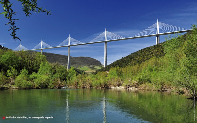
millau-viaduct-10
Photo credit
millau-viaduct-1
Photo credit
millau-viaduct-2
Photo credit
millau-viaduct-3
Photo credit
<Digimax S600 / Kenox S600 / Digimax Cyber 630>
Photo credit
millau-viaduct-7
Photo credit
millau-viaduct-8
Photo credit
millau-viaduct-12
Photo credit
millau-viaduct-13
Photo credit
millau-viaduct-15
Photo credit

Popville: Pop-Up Cities Book Perfect for Children

from:
http://weburbanist.com/2012/07/14/popville-pop-up-cities-book-perfect-for-children/

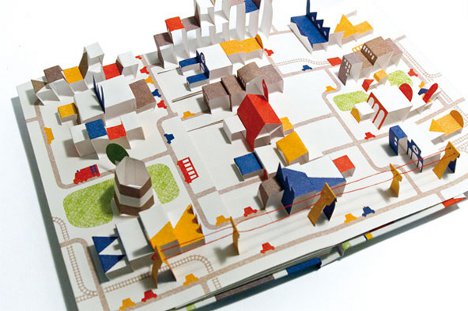
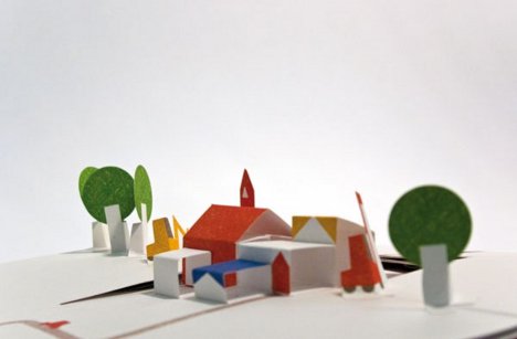
How does a parent introduce a love of architecture and urban planning into a child’s life? The Popville pop-up book might be the perfect accessory. The book, by Anouk Boisrobert and Louis Rigaud, tells the story of a single house that over time becomes the center of an entire bustling town.

The book begins with a single pop-up house at the end of a street. With every turn of a page, more buildings and streets begin surrounding the house. Eventually, a town begins to form.

By the end of the pictorial story, a town complete with electrical wires, a railroad, and plenty of buildings adorns the open book. The transformation from single house to whole village is a sweet and calm journey that could inspire just about anyone to be more interested in the urban growth happening all around us.

# ARCHITECTURES WITHOUT ARCHITECTS /// Details of a Proletarian Fortress

from:
http://thefunambulist.net/2012/07/14/architectures-without-architects-details-of-a-proletarian-fortress/


It is not the first time -nor it will be the last probably- that I evoke the Kowloon Walled City (see this past article for example) as a Proletarian Fortress which is very interesting to look at as it provides us a historical example of a district which immanently constructed its own form of urbanity. In few decades, this housing block like it exists many of them in Hong Kong, got transformed by its inhabitants into a compact piece of city in which all object and person finds its place and function despite the density. The section drew by Japanese architects for the book 大図解九龍城, is very illustrative of what life has been like in the Walled City as it includes a multitude of micro-scenarios animating the district from the darkness of the ground to the aerated rooftops. The Walled City, by its relative self-sufficiency was the object of many myths from the outside population and authorities who was seeing it as a criminal neighborhood, argument that was used to destroy it in 1993. The density of the district as well as the addition of many alternative bridges and pathways was making it indeed very difficult to control and the police is said to have simply gave up on it. From what several authors who worked on it tell us, although the walled city was a shelter for drug addicts, criminals were not living in it.
Graphic narratives seem the right way to describe such district as it allows the restitution of the richness of micro-events and sociality that were occurring in it. The global section (see below) is therefore full of small annotations describing those micro-events. Rio Akasaka had the good idea to translate them into English and to put them online. I also extracted a dozen of significant details from the section that can be seen below.


Toward an Uglier Architecture: Can We Keep Building and Keep the Mess?

from:
http://blog.bmwguggenheimlab.org/2012/07/toward-an-uglier-architecture-can-we-keep-building-and-keep-the-mess/

Testing_messy

If ugliness is better for our cities than beauty; if dirtiness is better than cleanliness; and if messiness makes for better, more vibrant, and livelier spaces than manicured perfection, how can we build that? Or at least, build for it?
This is one of many questions that came out of a debate that happened at the Lab Sunday afternoon. It came up shortly before the debate was cut off due to time constraints. But in my mind it is a question so critical in architecture and city development today—albeit one of the most complex and difficult questions—that I simply couldn’t let the conversation stop there.
The question came about after several hours of discussion around the idea of defining beauty or ugliness itself. The debate at hand at the Lab that day was all about aesthetics: when it comes to the city, what is beauty? Who gets to decide that? And what are the consequences of that decision when it’s applied to the urban fabric?
I needn’t summarize the entire debate to tell you that there was no consensus as to what makes something beautiful (or not) in the city—nor did anyone expect to find it. However, one of the panelists, Jürgen Krusche from the Institute for Contemporary Art Research, at the Zurich University of the Arts, brought to the table the argument that ugliness—a word he used to describe the sort of chaotic, patchwork wildness or messiness that a city garners when it is left to fall apart slightly—is what enables vibrancy to happen. What’s more, he argued that that vibrancy is more important to quality of life than “beauty,” which is often defined by cleanliness and order.
“Decay,” he said, “leaves gaps that allow for life to spread” and for people to self-build the urban fabric in accordance with their own dreams. That gives us a connection to our city, which makes us feel comfortable in it. But it also makes a city ugly, in the traditional city planner’s sense of the word, because it ultimately results in an uncontrolled aesthetic, which many associate with lack of safety and security.
Krusche made this same case in his now famous article, “Berlin ist hässlich—und das ist gut so!” (“Berlin is ugly—and it’s good that way!”), arguing that this is the phenomenon that helps make Berlin such an attractive city, even though it doesn’t live up to the usual standards of most cities that are highly ranked for quality of life.
Anyone who has been to Berlin knows very well that it is not, in the traditional sense of the word, a beautiful place. It is not only a city of mismatched architecture, much of which comes from what I would personally go so far as to call some of architectural history’s most depressing periods, but also one whose political and economic history has resulted in a much slower investment or re-investment process than in other places. That is a part of what has enabled Berlin’s seemingly lawless and DIY aesthetic—from its world-famous graffiti culture, to its endless supply of seemingly ownerless plastic chairs in random public spaces, to its occupied abandoned buildings and overgrown lots—to proliferate until now. It may not be “beautiful,” but it sure is lived in.
It’s not only Krusche that argues for this state of things in cities. When New York Lab Team member Charles Montgomery and environmental psychologist Colin Ellard gathered data about people’s emotional and physiological reactions to different forms of streetscape and urban design during their co-designed “Testing, Testing!” experiment, one of their surprising findings reflected, to a certain extent, the case for messiness.
They found that people actually felt happier and more aroused (the technical term environmental psychologists use to describe a general feeling of activation, excitement, and engagement) standing in front of an older, more crowded, messier streetscape than they did in front of the newer, simple, clean, blank façade of Whole Foods on Houston Street. What’s more, as Ellard emphasized to me recently when I called him to rehash my understanding of the experiment, the contrast was even stronger in visitors to the neighborhood and city than it was with local residents. This could suggest that the positive effect of a lived-in, messy, lively aesthetic goes even beyond the feeling of personal or community ownership that Krusche points to.
Big-box facades, like this one in New York, prove to be unappealing to many.
It’s clear that the defense of ugliness, or messiness, is not one that all would agree on. But if we are to concede, for a moment, that there is validity to this argument, the question then comes to the one I posed at the beginning of this post. How do we deal with this when building our cities? Or is it even possible to reconcile the necessity of new development and redevelopment with the need to allow for the gaps and decay that Krutsche argues enable ownership and liveliness to proliferate?
Is this something that can only come with time and disintegration, or is there a way to apply this to new development? If not, how long do we leave that messiness once it’s there? Can you legitimately ask a city to leave its empty spaces empty and not make them more “beautiful” when those spaces have an economic value and the city needs money? Is liveliness worth enough to warrant that? And if we do have to fill those gaps, can you ask a developer to fill them with new messiness, or something that encourages it? Is that even possible?
Can redevelopment and renewal happen when necessary without “cleaning up”?
Please start or join the debate in the comment section below.
. . .
Photos: by Charles Montgomery

Fire-Walking New York City

From: http://bldgblog.blogspot.com/2012/07/fire-walking-new-york-city.html


The New York-based group Common Room will soon be publishing and displaying in their space a series of walks around the city, walks that, in their words, "demonstrate, at four different spatial scales, the agency of combustion in shaping the city’s architecture, infrastructure and imaginary [sic]."

Devised and authored by Adam Bobbette, the tours will include sites and experiences such as walking "the perimeter of the great fire of 1835," exploring the "former sites of fire towers in Manhattan," and more:
Additionally, the tours recount the history of the fireproof building, the epistemological relationships between panoramas, hot air balloons and fire towers, the changing shape of water in the city, and the hyperreality of prevention. Together, these tours reveal another city nested within New York City, a city in plain view but rarely considered; this city is constituted by and through the management and care for its own inherent fragility, this city is named Combustible City.
I'm reminded of a recent book on my wishlist for the summer: Flammable Cities: Urban Conflagration and the Making of the Modern World by Greg Bankoff, which describes itself as "the first truly global study of urban conflagration." Bankoff "shows how fire has shaped cities throughout the modern world, from Europe to the imperial colonies, major trade entrepôts, and non-European capitals, right up to such present-day megacities as Lagos and Jakarta. Urban fire may hinder commerce or even spur it; it may break down or reinforce barriers of race, class, and ethnicity; it may serve as a pretext for state violence or provide an opportunity for displays of state benevolence. As this volume demonstrates, the many and varied attempts to master, marginalize, or manipulate fire can turn a natural and human hazard into a highly useful social and political tool."

Bobbette's fire walks of New York City will be on display at Common Room from July 16-August 16, and I believe more information will be available soon on their website.

(Previously on BLDGBLOG: The Fires. Thanks to Carlos Solis for the tip!)

Kroon Hall

from: http://www.architectmagazine.com/sustainability/kroon-hall.aspx

Kroon Hall, the new home for the School of Forestry and Environmental Studies at Yale University, is an ultra-green building targeting LEED Platinum. Meant to serve as teaching tools for the students within, the sustainable initiatives are on display where possible, but some--such as the creation of courtyards for students to gather and study outdoors--are more about good planning.

 The building has large skylights that admit daylight and also expose the rooftop photovoltaic system. Translucent enough to still allow light to filter through, the 100-kilowatt array provides 25 percent of the energy for the building, the rest of which will be purchased from sustainable sources. - Skylight - Wasco Skylight Products - Custom skylight system - wascoskylights.com - Ceiling beams - Goodlam, a division of Goodfellow - Structural red oak glulam beams - goodfellowinc.com - Doors - Builders’ Hardware - Custom doors - builders-hardware.net

Green design is an attractive alternative these days. But given the eco-friendly mission of the School of Forestry and Environmental Studies at Yale University in New Haven, Conn., building green was not an option. It was an imperative.
In planning their new $33.5 million building, school administrators not only sought to create a healthy place to study and work, they also wanted to bridge the gap between nature and people, deep in the heart of the city. That goal was met with aplomb by Hopkins Architects, of London, whose Kroon Hall—designed to consume half the energy of an equivalent academic building and reduce greenhouse gas emissions by 62 percent—is targeted to achieve LEED Platinum.
A blend of optimal performance and good design, the new home to faculty offices and an environmental resource center cuts a contemporary image while fitting comfortably among the venerable landmarks of Yale. “The challenge was to convert a backyard into a nice place,” says Hopkins director Michael Taylor. A gas-fired power plant, parking lot, and assorted dumpsters were removed from the site, replaced by the new academic center and two courtyards that knit the campus together. “That’s a big win,” Taylor adds.
Working with executive architect Centerbrook Architects and Planners and sustainability consultant Atelier Ten, Hopkins created a 58,000-square-foot facility whose tall, narrow shape and east-west orientation reinforce the active and passive strategies used to heat and cool it. The lowest floor is set into a hillside, with only its south side exposed, providing thermal insulation and increasing the amount of natural light that enters the building from adjacent courtyards. A south-facing colonnade encourages activity to spill outside.
Thick walls of Briar Hill sandstone on the north and south façades have operable, high-performance windows set deep within precast concrete surrounds to shade from summer sun. Raised above the walls is a barnlike roof supported by arched frames of laminated Douglas fir. The roofline, lined in red oak (half of which comes from Yale’s own forests), creates a third-floor loft that houses an auditorium, two classrooms, a café, and a large common room.
As part of the design process, the team evaluated some 25 different sustainable measures to determine which were most cost- and energy-efficient. A 100-kilowatt photovoltaic array on the rooftop proved most desirable. It supplies 25 percent of the building’s electrical need. (The remaining electricity will be purchased from renewable sources, allowing the building to meet its goal of carbon neutrality.) In addition, four solar panels embedded in the southern façades help provide the building with hot water. Heating and cooling is provided by ground-source heat pumps that draw water from four 1,500-foot-deep wells near the building.
Integral to the building’s design is a displacement ventilation system that moves air through a plenum and into occupied spaces through diffusers in the raised floors. Low-velocity fans in the basement keep the air circulating almost imperceptibly. Fresh air is fed into the building through this system in summer and winter. But in spring and fall the mechanical systems are shut down, and occupants (prompted by color-coded lights) open the windows for ventilation.
A rainwater harvesting system channels water from the roof and grounds to a garden in the south courtyard, where aquatic plants filter out sediment and contaminants. The graywater is then used for landscape irrigation or pumped back into Kroon Hall for flushing toilets. In tandem with low-flow fixtures, the system is expected to save more than 500,000 gallons of potable city water per year.
Just four years ago, Yale President Richard Levin pledged to achieve a 43 percent reduction in Yale’s greenhouse gas emissions by 2020. With the completion of Kroon Hall, the most sustainable building on campus, the university has taken concrete steps to achieve that goal.

Denver Central Platte Campus

Denver Central Platte Campus
 
Denver Central Platte Campus

RNL Design
Denver, Colorado

For the Greater Green: A public works campus in the Mile High City raises the bar for civic design with a series of distinctive buildings.

By Asad Syrkett
July 2012
Though it is set against the high drama of the Rocky Mountains, the city of Denver is remarkably flat. But along Interstate 25, a stretch of highway that runs north to south through the Mile High City, a series of facilities in a public works complex cuts a jagged form of man-made peaks. This is the Denver Central Platte Campus (DCP), a seven-building, 18-acre facility that serves as command central for the city's civic services. The campus—which includes a vehicle garage, a fuel-and-wash facility, and a massive salt dome, among other structures—totals nearly 112,000 square feet. If this doesn't sound like the usual arena for design-minded sustainable construction, that's because it isn't: Of Denver's 20 LEED-certified buildings owned by public agencies, DCP's LEED Gold fleet maintenance building and Gary Price Operations Center are the only municipal facilities that made the list.
Doing something different with a generally lackluster building type was exactly what Tom Wuertz and Dick Shiffer, design principal and senior principal at RNL, respectively, had in mind. "We wanted the architecture to scream sustainability," Wuertz quipped during a recent tour. So, to make the best use of their prominent, highway-side site, RNL topped the 29,000-square-foot operations center with a sawtooth roof you'd be hard pressed to miss while driving down the interstate. Panes of translucent polycarbonate on the roof's north-facing sides provide ample interior daylight, while the south-facing slopes of each "tooth" accommodate photovoltaic (PV) panels. This innovative thinking helped the team win the commission in a competition hosted by Denver's city government.
The atypical roof form and RNL's commitment to aesthetics weren't without technical complications: RNL's design called for general contractor Pinkard Construction to reposition the corrugated metal panels on the operations center's facade so that the panels would be on a diagonal, rather than in the more traditional vertical orientation. "We did some pretty extensive constructability reviews," says Tony Burke, senior project manager at Pinkard. He cites waterproofing the roof as a particular challenge. "It ended up requiring some dismantling and reassembly to make sure things fit tightly." RNL took a similar tack with the 40,000-square-foot vehicle maintenance facility: It also features diagonally corrugated panels on its peaked rear facade, but PV panels have yet to be installed due to budget constraints.
Inside, the steel-frame operations center is high-ceilinged and light-filled, with offices, men's and women's locker rooms, and a trio of open storage spaces that house various equipment and materials: large street sweepers, piles of metal, and reams of foam, among other items. The building also holds a flexible multipurpose area called a muster room, in which workers frequently gather for debriefings and other, less formal meetings. RNL specified custom cut low-e glass to fit to fit the irregularly sloped window casings.
At the fleet maintenance building, RNL's primary concern was to provide easy-to-use work areas. Large winches and other machinery for vehicle maintenance occupy open bays, while RNL carved out separate areas for welding, tire repair, and various operations essential for the city's convoy of trucks and sweepers. Buildings like these usually hog energy, because "a lot of outside air needs to be brought in for ventilation and vehicle exhaust needs to be pushed out, all while balancing cooling and heating," explains Ken Urbanek, associate principal at MKK Consulting Engineers. To help mitigate these problems, MKK specified radiant flooring, as well as an HVAC system that "uses heat-recovery systems to reuse energy from the exhaust air stream" from vehicles, and avoided refrigerant in favor of evaporative cooling systems, which "work really well in our semiarid climate," Urbanek explains.
Environmental issues informed exterior spaces, too: Heavy-metal contaminants like arsenic and lead lurked in the layers of sediment beneath the campus, remnants of previous public works buildings on the site. To prevent these pollutants from seeping into the nearby South Platte River—which, along with a public bike path, runs parallel to the operations center—RNL capped the site with a 12-inch layer of clay and covered it with an aggregate of pebbles and crushed, recycled glass from Colorado beer factories. "When we first placed the glass, you could walk across it and still the smell the beer," says Shiffer, with a laugh.
Wuertz and Shiffer hope DCP will help retool thinking about how public works facilities are built and designed. Municipal projects can—and should—be held to the same standards as other building types when it comes to sensitivity to place, scale, and environmental impact, Wuertz argues. "We didn't separate DCP from the highway, the bike path, the river," he says. "We thought 'This has to be a good design. We need to be good neighbors.'"

Friday, July 20, 2012

Farmstead Next to the Chapel

TGIF!
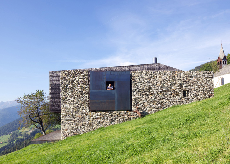
Today's YEOW will be on Farmstead Next to the Chapel by architects, bergmeisterwolf.

Enjoy~!


"Next to the chapel, farmstead b, sterzing
The site is situated in a little village, above Sterzing, on a height of 1.400 m above sea-level. Out of a farmhouse with an old oven (made of stone) which were both fit for demolition a new holiday residence of the Brunner family should arise.
Together with the historical chapel an ensemble on the mountain should come into existence.
It was important for us to integrate a place to live, a sauna, a garage and a henhouse into the landscape. All new buildings were inserted into the landscape without changing the topography. They should be separated according to their function, form and material and still create a unity because of their positioning.
We worked with the found, the discovered – the landscape as well as the remains of the old farmhouse like the stone wall and the traditional materials as for example the shingles from the chapel.
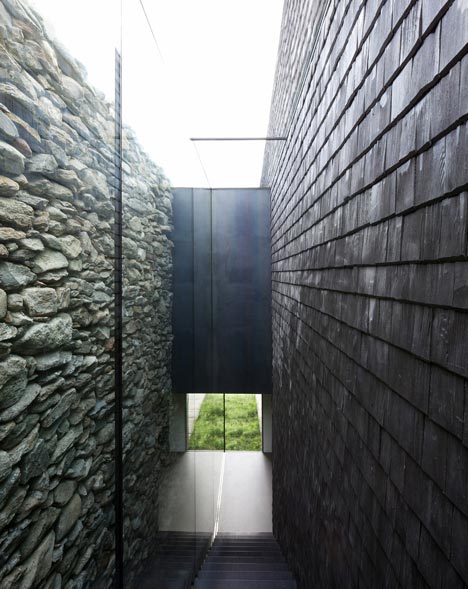
The starting point was the old stone wall of the farmhouse for us. After a long search we finally found workers (stone artists) who were able to rebuild it according to old architecture without mortar. The structure was covered with shingles following the roof also on the soffit, they were exposed to wind and weather already 1 and a half year before in order to achieve a relatively uniform weathering , a silvery tone.
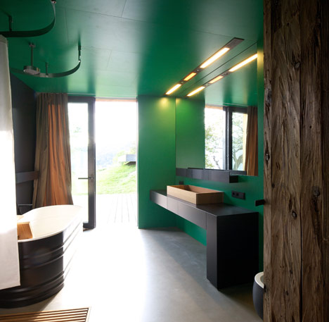
Simple materials, like the concrete ceiling which was roughly structured with laths, glass elements, as well as steel and wood characterize the interior. As a basic principle old materials were reused and combined with new ones.

 Farmstead Next to the Chapel by Bergmeister Wolf
At the same time, a sauna box belongs to the ensemble which is stuck in the territory. The simple element was supplied with earth-coloured plaster.
The roof is intensively covered with greenery. The jutting out and pending terrace is roofed but at the same time also open and offers a wonderful view over the valley.
On the other side there is the garage, an almost black cube in the landscape, covered with greenery, simple with small cut-outs and larch-wood laths.
 A game between architecture, landscape and art should come to life." -bergmeisterwolf


Farmstead Next to the Chapel by Bergmeister Wolf

for more literature, go here: http://www.dezeen.com/2012/07/08/farmstead-next-to-the-chapel-by-bergmeister-wolf/

Friday, July 13, 2012

Happy Friday the 13th!

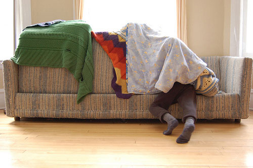
For today's YEOW, I thought it be nice to go take a look at Couch Cushion Architecture; A Critical Analysis by BUILD LLC.
It really brings me back fond memories of my childhood when I used couch cushions to make my own space...:)
Enjoy!
-H

Before we were influenced by Mies van der Rohe or Frank Lloyd Wright, before we had seen the visual delights of Ronchamp, Pompidou Center and the Bauhaus school in Weimar, we were driven by a greater force of design inspiration. More primal and immediate than any of the previously mentioned examples, it was couch cushion architecture that established the basic building blocks of our design logic. Unrepresented and ignored for too long in the architectural industry, today’s post pays respect to the wonders of couch cushion architecture. We’ve rounded up a (mostly) admirable collection of projects, taken from a randomly conducted search on the internet. Join us as we take a critical analysis of the architecture, methods and design philosophies of living room furniture re-appropriation.


[Copyright Jennifer Larson]
A clear derivative of the Miesian box, this handsome project is “informalized” with the use of colorful, freeform roof panels. Taking further direction from the Archigram movement, the project explores architecture as body wrap and propels couch cushion architecture to new and exciting territory. Grade: A

At first glance the composition appears unintentional and the construction shoddy. But further investigation reveals a clear delineation between indoor/outdoor space with a design focus on protection through the use of barrier. Planes are shifted off the orthogonal to accommodate function; as a side effect it relieves inhabitants from a harsh Euclidian geometry. Grade B

Benefiting from the life work of structural engineer Heinz Isler, this lightweight roof shell structure creates a graceful span while fully sheltering the interiors. Massive counter-weights keep the structure taught while an entire façade remains open to the exterior. Grade: B

The crisp, clean, white planes, drawing clear influences from Richard Meier, are balanced with a splash of color offered by the roof membrane. The disciplined interiors offer relief to the eyes with a subtle yet intentional blue tone. Grade B+

A brilliant synergy between the weighted foundation and the light tensile structure, this project impressed us with its attenuation of structure and bright interior spaces. The courtyard and formal entry are also well thought-out and provide a clear means of way-finding. Grade A+


FOR MORE COOL PHOTOS OF COUCH CUSHIONS, GO HERE:

http://blog.buildllc.com/2010/04/couch-cushion-architecture-a-critical-analysis/